Monthly Archives: March 2011

Anatomy of a Freebie-filled Design

While designing this invitation I realized that I use a lot of freebies. The web is chock full of helpful websites that just give away all kinds of royalty-free goodness for designers like me and you. I would like to give thanks to these altruistic souls and also showcase what can be done with these fun finds.

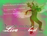
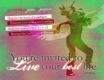
My favorite site to get all kinds of fun textures, free fonts, brushes and insight is Bittbox.com. Bittbox is Jay Hilgert, a self-described, “Freebie Maker.” He updates his site regularly with new free stuff and also very helpful tutorials. I used one of his free brushes on the sun to give it the fun “flower” look.  (number 4).

A great resource for buying/selling vector artwork is Vectorstock.com. With a free registration you also have access to a whole bunch of free vectors. They run the gamut of flowery and pretty to grungy and urban. There is also a lot of seasonal designs. I like to use these free vectors but to pick them a part for the good stuff they include. Like the roller skate (number 1), and the sky background texture (number 2) and the background and butterflies (number 5).

For a while now I’ve been obsessed with fonts. I’ve amassed a collection of about 3000 over the years, but lately, I’ve been lucky to find some really fun free fonts. The prominent font used on this invitation is Deibi (number 3). I got this really fun front from behance.com. Behance is a great resource for finding design jobs, great inspiration from other designers and a cool section called, “tip exchange” where designers share their tips in a forum setting.

Found! Coolest. Font. Ever.

I was noodling around in some old Dynamic Graphics Magazines I have laying around, looking for inspiration for a project I’m working on when I see this in the December 2008 issue:

It’s the font that created that cool headline treatment I spoke of before here.

Isn’t is so awesome? The lines and squiggles included means the sky’s the limit for growing the squiggles off the letters or creating unique shapes and borders.

I love it! Kudos to Marian Bantjes!

via: bantjes.com

Evolution of a postcard

Recently I made this postcard for a client. It’s to give to her clientele which are all woman who are healing from something in their pasts. The visual I wanted was a “dancing warrior woman” so after googling around I found a cool picture and I created a vector illustration. I really liked her hair swinging and kick-ass tribal woman abs, but the client thought the abs and short skirt might be too showy, so now she has on pants and a tank top. Thanks Illustrator! It’s also interesting to see it go from less emphasis on the text to making the text pop with the contrasting boxes.

Save the ink! Smell the paper!

I redesigned this RSVP Invitation because a client said as she was trying to print it out, it was using all her ink. I hadn’t thought of that when I designed it originally using the dark rich colors and the complex, layered background. I just wanted something fun that evokes evening. Girls night out. Red wine.

Ink is very expensive, so I totally understand. It did get me thinking about how different designing for print and for web can be. My background was mostly print until the last few years, but I’m already thinking a lot of the times in terms of how the design will look on the web or via email, etc.

Currently I’m working on a couple of brochures and I’ve had to get back into the print mindset with trims, bleeds, CMYK, InDesign, hi-res, etc. It’s fun! It makes me miss working at a magazine. I still really love paper and nothing is better than the smell of freshly printed, brand new magazine hot off the distributor’s truck!

(If you want know more about my invitations click on the RSVP link.)

When type love becomes obsession.

I seem to be obsessed with fonts and type treatment these days. This didn’t help! It’s so lovely and fun and hand-drawn looking. Ever since I saw it in the Spring Issue of Publix Grape Magazine, I’ve been unable to stop staring at it, trying to figure out how much of it is a font and how much of it is the work of a talented designer. Since the magazine doesn’t have a masthead and my friend Google isn’t helping either, I can’t find this designer  to give him/her their props. So whoever you are KUDOS!

The quest to find this font continues…